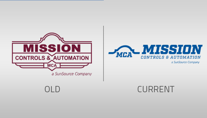
Since being established in 1990, Mission Controls & Automation has continued to grow and evolve with the industry. From its modest origins as a two-person electrical wholesale distributor operating out of a garage, the company has evolved into a dynamic team of over 50 associates, providing comprehensive systems integration services and crafting custom control panels. However, it’s not just the company’s size and services that have transformed over time. Their logo transformation serves as a testament to the company’s adaptability and commitment to staying relevant in a dynamic industry as well.
A Humble Beginning
Mission Controls & Automation began its journey as an electrical wholesale distributor in September 1990. The logo was a collaborative effort between brothers David and Don Gardner. Not only were both illustrators and in the electrical business, but they also shared a deep fondness for Texas history.
Their logo design fused these two passions, featuring an old Cutler Hammer with the iconic Alamo on top. This creative blend captured their commitment to both their industry and their Texan heritage.
The Logo Transformation
One crucial factor that influenced the logo change was Mission Controls & Automation’s desire to expand beyond their San Antonio roots. While their old logo represented them well in their home city, it wasn’t versatile enough to transcend regional boundaries. They aimed to become a recognized name in markets all over, creating a need for a logo that could appeal to a broader audience.
At the time, their logo displayed the name “Mission Controls and Supply,” signifying their core focus on electrical supplies. However, over the years, the company evolved, and their services expanded beyond just supplying electrical products. Around eight years ago, the company made a pivotal decision—to update their logo from “Mission Controls and Supply” to “Mission Controls & Automation.” This change reflected a significant shift in their business operations. They no longer primarily handled electrical supply but had transitioned to a more automation-centric focus.
The Mission Controls & Automation Today
In 2023, the time came for Mission Controls & Automation to update their logo again. Why? The old logo was outdated, reflecting an antiquated image rather than a modern, forward-looking company. Additionally, their previous logo did not align well with their marketing efforts. When applied to promotional materials like shirts and hats, it didn’t resonate effectively.
While the new logo is still relatively fresh, Clint Gardner of Mission Controls & Automation expressed his excitement about it. “The updated logo’s color aligns with the logo of Electro-Matic’s, which signifies a synergy between the two entities. It also shares similarities with SunSource, reinforcing the idea of a unified team,” he explained.
Mission Controls & Automation’s logo transformation serves as a testament to the company’s adaptability and commitment to staying relevant in a dynamic industry. As they continue to evolve and expand, their logo reflects not only their roots but also their aspirations for the future—a future where they are known not just in San Antonio but across the region.


